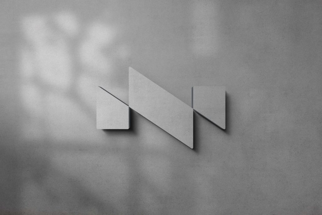
A start-up architecture firm approached Eight and wanted our help with logo design and brand development. Their agency offered a Scandinavian clean and minimalist design and we thought it was consistent with our development of the brand.
Through a pre-study, including a workshop, we looked at everything from the owners’ objectives to the industry as a whole. Finally, we pitched three different names and also different visual styles.
The result was Nest Architecture. The word Nest brings to mind a bird’s nest and an idyllic place with a nice view. Many people have seen a bird’s nest up close and have been impressed by how well made it is. It blends many different natural materials to form a dense mass that is stable and resistant to both low temperatures and high heat. The word is easy to pronounce, write and is pronounced the same in both English and Swedish.
In our logo design, it was important to capture the essence of the company’s style of architecture. We therefore focused on minimalist design with clean shapes and a natural feel. The symbol consists of two N’s that intersect and together create an N in an interesting shape. The two letters are a metaphor for the two founders who run and develop the company together. The symbol also aims to bring to mind buildings from a bird’s eye view. The simple shape is easy to use and can also be experimented with as we can fill it with different materials and patterns – just like a building. For the launch of the logo, we created a 3D model where the symbol was made of concrete and could be used on the website, social media and also in physical form in the office.
We also helped Nest Arkitektur design their website, where we could apply the newly developed branding. Initially, we developed a landing page with support and then expanded with customer cases and more information about the company.

